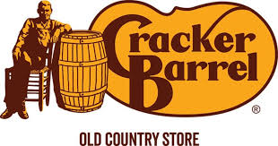
Cracker Barrel has done something it hasn’t done in nearly half a century: it retired the familiar image of an overall-clad man leaning on a wooden cask and replaced it with a simplified, text-only word mark. The move is part of a broader brand refresh touching restaurants, retail, and marketing—and it has ignited a coast-to-coast debate about heritage, modernity, and what customers expect from a quintessentially “country” brand.
Below is a thorough, plain-English guide to the redesign—what changed, the thinking behind it, why the reaction has been so intense, how it compares to other brand updates, and what to watch as Cracker Barrel rolls the new identity and store experience across the chain.

A quick recap: what actually changed?
Cracker Barrel unveiled a new logo that drops the long-running illustration of a seated “barrel man” and the literal barrel altogether. In its place is a cleaner, text-forward word mark set in the familiar brown on a golden—slightly irregular—badge shape. The company describes the mark as “rooted… to the iconic barrel shape and word mark that started it all,” linking the update to the brand’s earliest identity from 1969, which emphasised type over illustration.
In short: same colours, far fewer pictorial details, a stronger emphasis on typography and a distinctive silhouette in the background. To the brand’s design team, this consolidates recognition into the name and its proprietary letter forms. To many fans, it’s a dramatic break from the folksy art that defined the brand’s signage for decades.
Why Cracker Barrel says it made the change
The logo is one visible piece of a larger modernisation program under CEO Julie Fess Casino, who took the helm in late 2023. The refresh—branded in marketing as “All the More”—aims to make the company feel contemporary while keeping its signature hospitality and Southern comfort food at the centre. Casino has said the response to the overall refresh has been “overwhelmingly positive,” even as the logo itself has sparked debate.
From a brand-strategy lens, the rationale has three pillars:
- Simplicity at small sizes. In an era where logos must work on phone screens, apps, and social icons, detailed line art often loses clarity. A text-forward mark scales more cleanly and is easier to reproduce across digital and physical touch points. (Cracker Barrel explicitly framed the redesign as a cleaner, simpler evolution rooted in its original word mark.)
- Consistency across renovations. The company is remaking stores—lighting, decor, and layout—and expanding marketing beyond nostalgia to “modern country” warmth. A simplified logo makes it easier to build cohesive signage systems, menus, packaging, uniforms, and in-store merchandising.
- Signal a broader reset. Brand marks often serve as shorthand for deeper shifts—menu updates, retail changes, and service improvements. Cracker Barrel’s identity refresh is intended to telegraph that the chain is evolving while holding onto its colours and name recognition.

The backlash—and why it got so loud
The new mark triggered a fast, polarized reaction online. Some critics labeled the wordmark “sterile” or “soulless,” and prominent conservative figures framed the removal of the barrel man as a cultural capitulation akin to other brand controversies. Media outlets across the spectrum chronicled the critique, memes, and political commentary that followed.
A few dynamics amplified the response:
- Loss aversion and brand nostalgia. When customers feel ownership of a brand, visual changes can feel like subtraction—even when core products stay the same. The 1977 illustration had become a mental shortcut for “Cracker Barrel,” so its absence reads as loss.
- The culture-war frame. Because the brand evokes traditional Americana, any modernisation can be interpreted through political lenses. Commentators compared the move to other re brands that retired longstanding Native or pastoral imagery (e.g., Land O’Lakes), making the conversation less about letter forms and more about values.
- Social media’s outrage mechanics. Visual changes are instantly shareable: before/after images invite snap judgements, and platforms reward extreme reactions, not nuanced design critique. Coverage from national outlets further amplified the noise.
Did the market care?
At least initially, yes. Following the announcement and public blow-back, Cracker Barrel’s stock fell sharply, with several outlets noting a double-digit intranet decline and a market-value loss approaching $200 million. Whether that move reflected the logo itself, fears about a broader repositioning, or opportunistic trading in a volatile tape is debatable—but it underscores that brand perception can influence investor sentiment, at least in the short run.
Markets often overreact to symbolic events and then reassess as fundamentals—traffic, check averages, remodel ROI—come into focus. The longer-term test will be whether remodeled stores, refreshed menus, and updated marketing drive comp sales and guest satisfaction. The logo won’t carry that load by itself, but it can help—or get out of the way—if the rest of the experience improves.
What designers see (and what most people feel)
From a design perspective, there are clear pros and cons:
- Pros
- Scalability & legibility: The word mark reads cleanly at small sizes, where the old illustration could collapse into visual noise.
- Ownable letterforms: The interplay between the oversized “C” and “B” and the customized curves can be trademark-distinctive—useful in a crowded category.
- System-friendliness: A simple logo integrates more easily into signage, menu layouts, packaging stickers, digital avatars, and motion graphics.
- Cons
- Emotional equity risk: The barrel man carried storytelling power—heritage, porch culture, country store vibes—that pure type must now convey through tone, photography, and environment. Losing that illustration increases pressure on the rest of the identity system.
- “Generic” perception: Without careful typographic personality and a strong voice, text-only restaurant marks can read as interchangeable, especially to casual observers who don’t notice subtleties in letter shapes. Early reactions included exactly that critique.
For everyday guests, a logo is less about keening and more about feeling. The old sign said “old-timely” at a glance. The new one needs the remodelled environment—warmer lighting, curated decor, and menu stories—to deliver the same cue in a modern way. If the biscuits are hot, the coffee is fresh, and the service is welcoming, guests may stop noticing the sign. If the experience wobbles, the logo becomes a scapegoat.

How this compares to other big brand updates
Cracker Barrel’s move sits in a long line of “simplify and streamline” re brands driven by digital use cases: think Burger King’s retro-modern update, Popeye’ word mark refinement, or Wendy’s iterative cleanups. Where it differs is the removal of a beloved illustrative character rather than a restyle—closer to Land O’Lakes when it dropped its Native American imagery, which also triggered value-laden commentary. The resulting discourse is less about design craft and more about what the brand “stands for.”
The broader modernization effort
Logo aside, Cracker Barrel’s revamp includes store remodels, updated lighting, refined merchandising in the retail shop, and new marketing that leans into a “modern country” vibe. Executives pitched the campaign as celebrating scratch cooking and hospitality in a way that feels timely rather than museum-like. The “All the More” platform frames visits as more than a meal—food, shopping, and togetherness under one roof.
A successful brand update usually pairs visual identity, experience design, and operations. If new layouts shorten waits, if fixtures make shopping easier, and if the menu communicates clearly, then the identity earns its keep by supporting clarity and warmth. If those changes miss, the logo will catch heat it doesn’t deserve.
What success would look like (and how we’ll know)
In the near term (0–6 months):
- Consistent roll out: Updated signage, menus, uniforms, and digital channels show one coherent look. (Fragmentation is deadly—customers expect the same experience online and on-premise.)
- Employee embrace: Teams understand the “why,” and the new materials make their jobs easier—cleaner menu layouts, clearer directional signs, intuitive packaging.
- Noise abates: After the first news cycle, sentiment normalizes, and conversations shift to food and hospitality rather than fonts.
In the medium term (6–18 months):
- Guest metrics: Satisfaction, intent to return, and value perception improve in remodeled locations.
- Sales lift: Remodelled stores outperform the chain average; if not, the company revisits which elements matter most (lighting, seating, merchandising mix).
- Digital performance: Engagement rates on social and email, as well as app metrics, benefit from clearer visuals and messaging.
In the long term (18+ months):
- Identity endurance: The wordmark feels “normal,” even inevitable, because the rest of the brand experience reinforces it.
- Cultural resonance: Marketing leans into stories—recipes, makers, music—that recapture the narrative warmth once bundled into the barrel man illustration, but without the visual clutter.
Why reactions to logo changes feel so personal
When you’ve spent years meeting family at a place, a logo is part of the mental picture of those experiences. Behavioral science calls this associative memory—we bind meaning to symbols. Remove the symbol and it can feel like the memory is being erased, even if the pancakes still taste the same. Brands that navigate big visual changes well usually:
- Tell the story clearly: Explain what’s changing and what’s not. (Cracker Barrel has emphasised continuity in colours and heritage.)
- Show receipts: Pair the new look with tangible improvements—faster seating, better lighting, easier-to-read menus.
- Invite participation: Feature employees and guests in campaigns, so the brand’s humanity carries the emotion the old illustration once carried.
Fair criticisms—and fair defenses
Fair criticisms:
- The wordmark puts more interpretive burden on environments and marketing to convey warmth. If the stores feel cold or generic, the logo will be blamed.
- The new badge shape is subtle; without the barrel outline, some may not “get” the barrel reference at all.
- In a category full of script and slab serif wordmarks, standing out requires exquisite consistency and distinctive typography.
Fair defenses:
- A 1970s illustration optimised for roadside pylons isn’t ideal for 2025 app icons and responsive websites; modernisation is practical, not ideological.
- Removing dated line art does not erase heritage; it shifts storytelling to photography, motion, and in-store experiences.
- Colo equity (the golden/brown palette) carries more memory than many realise; keeping it preserves instant recognition.
Investor take: symbolism vs. fundamentals
Investors don’t ultimately care about logos; they care about traffic, margins, and brand health. But symbolic moves can signal management conviction—or distraction. The initial stock drop that accompanied the backlash suggests the market is cautious about how far and how fast Cracker Barrel can modernise without alienating core guests. The only durable answer is operational: better comps in remodelled stores, stable check growth without discount addiction, and evidence that the refresh pulls in incremental younger families while keeping loyalists happy.

Lessons for brand leaders watching from the sidelines
- Audit what your logo is really doing. If an illustration tells a story you can tell better elsewhere—through video, interiors, or service rituals—simplifying the mark can reduce noise. If the illustration is doing heavy emotional lifting you can’t replace, tread carefully.
- Change the experience with the mark. A logo on its own rarely changes minds. Tie it to undeniably better experiences, and the visuals become shorthand for improvement rather than a target for frustration.
- Own the narrative quickly. In high-salience categories, an explanatory blog post, interviews, and concrete examples of “what’s better now” can inoculate against bad-faith narratives. Cracker Barrel’s CEO has made the case on national platforms and underscored continuity in values, which is a smart first step.
- Expect turbulence. Even excellent redesigns face a week or two of “I hate it” takes. Build that into your plan—and into how you brief teams and franchise partners.
Frequently asked questions
Is this the first time Cracker Barrel has ever changed its logo?
No. Company leaders note this is the brand’s fifth logo evolution since its 1969 founding. The 1977 “barrel man” version lasted the longest and became the most iconic, which is why its retirement feels so significant.
Did Cracker Barrel change its name or colours?
No. The name remains “Cracker Barrel,” and the colour palette continues to revolve around the signature brown and golden tones—elements the company explicitly highlighted to signal continuity.
Is the redesign political?
There’s no evidence the design choice itself is political; the company frames it as a modernisation rooted in its earliest word mark. The online discourse has politicised it, as often happens with legacy American brands.
Will the old logo disappear immediately from every store?
Large roll outs take time. Expect to see a mix of old and new signage as the company phases updates in alongside remodels and marketing refreshes. (Media coverage describes the change as part of a broader, ongoing modernisation.)
Who’s leading the effort?
Julie Felss Masino, CEO since November 2023, is guiding the modernisation push, supported by the company’s marketing and design teams under the “All the More” campaign umbrella.
The bottom line
Cracker Barrel’s new logo is a bold simplification that trades a beloved illustration for a cleaner, more flexible word mark. That trade unlocks practical benefits—legibility, digital versatility, system consistency—but carries emotional risk by removing a symbol many guests associate with memories and meaning. The ferocity of the initial response reflects both nostalgia and the way cultural debates now attach themselves to corporate design choices.
Will this be remembered as a misstep or a smart modernisation? That depends less on the curves of the “C” and “B” and more on whether the chain convincingly marries the new identity to better experiences: refreshed stores that feel warm and welcoming, menus that deliver comfort with clarity, and service that embodies the hospitality the brand promises. If those pieces click, the new sign will eventually read not as subtraction but as a confident, contemporary frame for the same country hospitality people came for in the first place.
Sources & further reading
- The Washington Post coverage of the roll out, critique, and market reaction.
- Forbes roundup of the redesign and ensuing backlash.
- Fox News reporting including remarks from CEO Julie Fells Casino on response and rationale.
- Bloomberg on the stock move and investor response following the logo’s debut.
- CBS News on market-value impact and the redesign details.
- ABC’s Good Morning America segment outlining the “All the More” campaign and CEO commentary.
- Additional background on Cracker Barrel’s logo history and brand context.


